Descriptive Statistics Viewer
The Descriptive Statistics Viewer enables you to generate different descriptive charts and graphs that illustrate and summarize the data. Indeed, you produce plots that show the data: trends, specific features, or any definite statistic. You have the choice between pie charts, histograms, boxplots, and multi-bar plots.
This tutorial assumes that you already selected a project and imported data. For more information please visit on Project and Import Data section.
In reference signal, string or numerical data type can be used with Sunburst Plot. if input signal data type is string then automatically statistical method is count . If users use numerical data as a reference signal, they can use any of the statistical methods.
User Interface Structure
This section helps you to get familiar with the interface elements where the configuration is divided into: - Plot settings - Filter
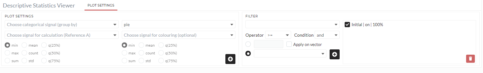
Figure: Descriptive statistics viewer user interface
Plot Settings
The following options are required to generate a plot in a descriptive statistics viewer.
Choose categorical signal (group by)
Select the categorical signal you need to plot. The options differ from the type of plot: - Choose categorical signal A (group by) is always required for all plots. - Choose categorical signal B (group by) is only needed for the bar(combined) and bar (nested).
Choose signal for calculation (Reference A)
Select a signal, which will be used for calculation. The type of signal can be numerical or categorical.
Choose plot type
Here, you have the choice between different types of plots you can select: pie, donut, bar, box, histogram, bar(combined), bar (nested), bar(multi), sunburst.
Choose signal for coloring
This is an optional selection you can use if you want to associate a specific signal for coloring.
Statistics for Reference A
Pick one of the statistics (minimum, maximum, sum, mean, count, standard deviation, quantile 25%, quantile 50%, and quantile 75%) used to calculate the reference A signal.
Statistics for coloring
Pick one of the statistics (minimum, maximum, sum, mean, count, standard deviation, quantile 25%, quantile 50%, and quantile 75%) used to calculate the coloring signal.
ADD
The icon + is used to generate the configured plot.
Filter
Use the filter to apply the plot only to a specific part of the data. see Filter for a more detailed description of filters.
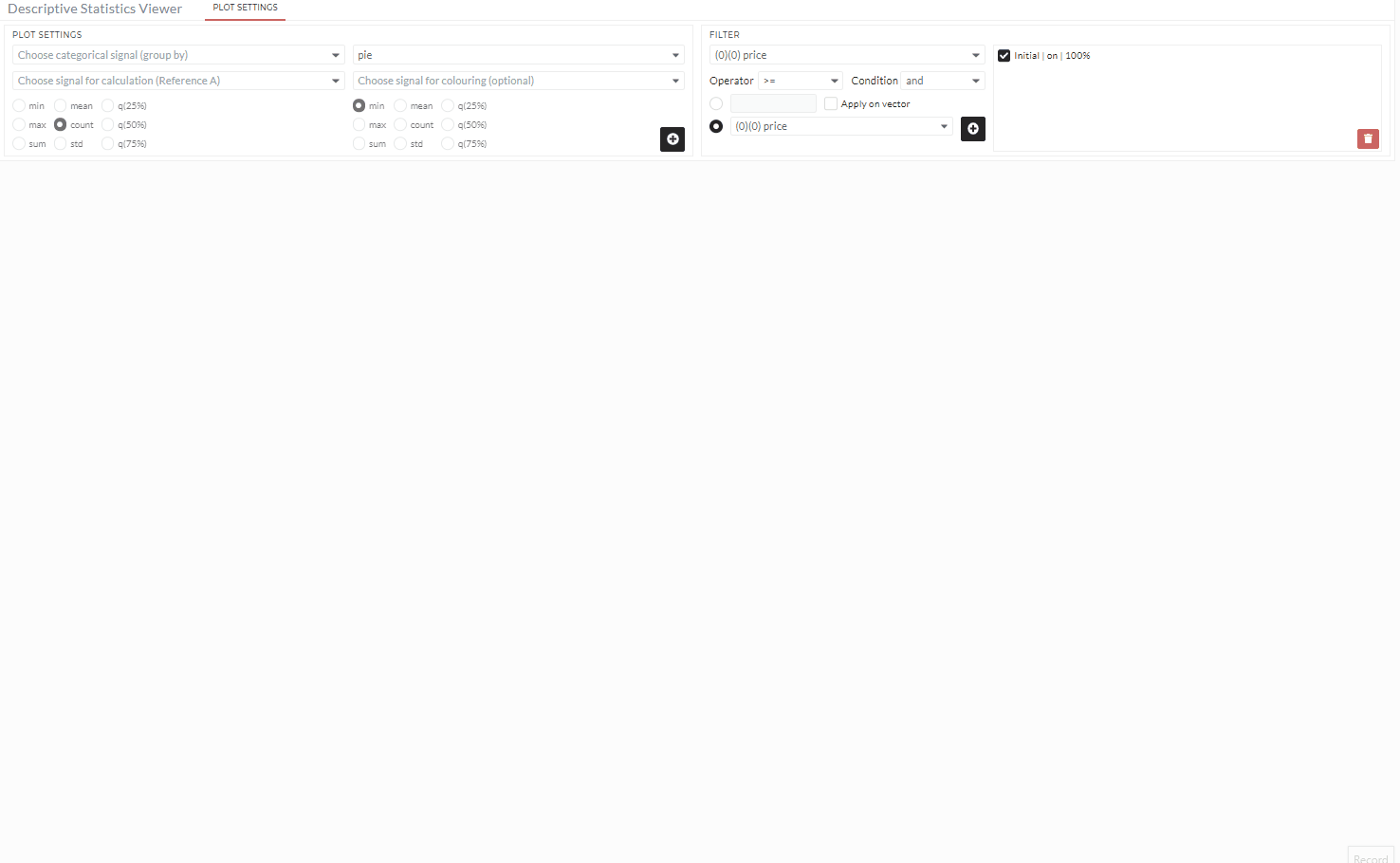
Basic Usage
Generating a plot in Descriptive Statistics Viewer is simple and always follows these basic steps:
- Choose the categorical signal you need to visualize.
- Select to which reference the calculation is done.
- Select a plot type from the list.
- Select which statistic is considered for calculating the reference A signal.
- If you don't set a coloring signal, the reference signal is used per default.
- Add to generate the plot.
The following animation shows an example usage of bar combined plot:
Example- Sunburst Plot
The descriptive viewer's Sunburst Plot is excellent for visualizing hierarchical data structures. It is made up of four rings. Each segment's angle is proportionate to a value or divided evenly under its inner segment. The plot segments are colour-coded according to which category or hierarchical level they belong to.
Creating the plot
The following instructions are divided into four parts, one for each ring number, and will guide users through the process of creating a successful sunburst plot:
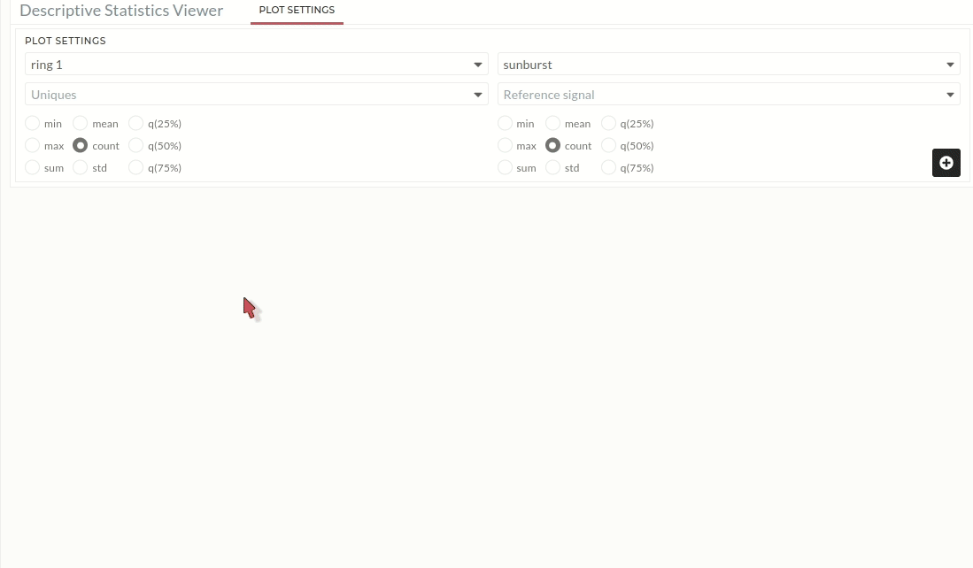
Ring 1:
The user will get Figure 01 where default ring 1 is set up after clicking on sunburst from the Descriptive Statistics Viewer plot settings. The user must provide the following information:
- Users have to choose a signal for Uniques. This signal is used to create a segment of the ring Figure 01.
- A reference signal (Choose signal for colouring) also have to choose to calculate the area value of each segment Figure 01.
- Then click on the plus icon which will generate the first ring.
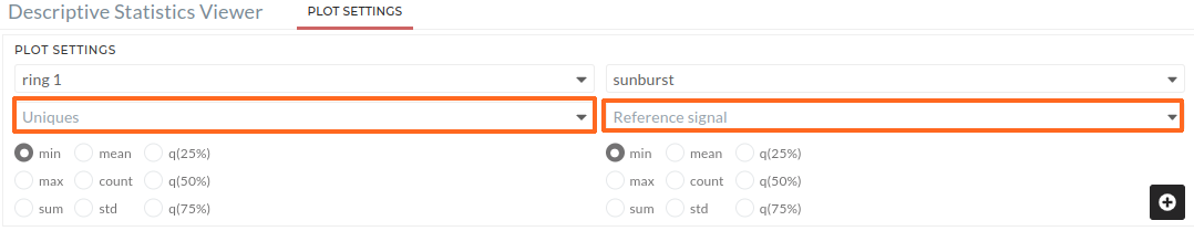
Figure 01 : Sunburst plot (Ring 1). Users need to choose signal for orange color boxes.
Ring 2:
After you've created the first ring, click ring 1 to see a list of ring numbers that are accessible. As seen in Figure 02, the user can now click on ring 2 to generate the second ring. The user must add the following input:
- For Uniques, users must select a signal. This signal is used to make a ring segment Figure 03.
- A reference signal is required to calculate the area value of each segment, however this signal is usually the same as the first ring's reference signal Figure 03, which is automatically taken from the first ring input. Users can also adjust the signal based on their need.
- Then click on the plus icon which will generate the second ring.
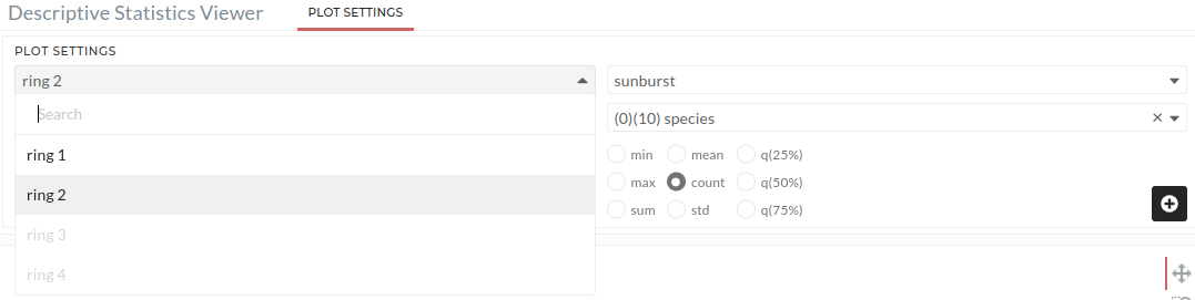
Figure 02: List views for ring 2 in sunburst plot. Users need to click on ring 2.
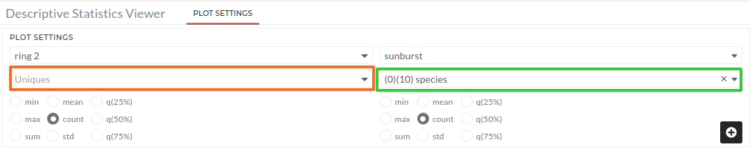
Figure 03: Sunburst plot (Ring 2). Users must select a signal for the orange colour box (Uniques). The green colour box (Reference signal) is prefilled, but users can change it if they want.
Ring 3 and 4:
Users must repeat the Ring 2 instructions for Ring 3 and Ring 4.
Demo
The following animation shows an example usage of sunburst plot:
Sunburst plot supports a reference signal string or a numeric data type. If the input signal's data type is a string, the count will be the default statistical approach. Users can apply any statistical method if they use numerical data as a reference signal.