Welcome to the Iris Use-Case Tutorial
One of the most popular and beginner-friendly examples in the machine learning classification is the iris use case. It is about a flower type called Iris, with three sub-categories, Setosa, Versicolor, and Virginica. The dataset contains sepal length, sepal width, petal length, petal width, and the species of the flowers.
This demonstration aims to train several Machine Learning (ML) models to classify the iris flower correctly depending on the given features. After establishing a good-performing ML model, we will build a go-live Story and App.
This Tutorial is for absolute platform beginners. Therefore we will describe each step very concisely. However, we will not discuss the Iris flower itself and its features. To have the best learning experience within this course, we will also conduct several visualization techniques and compare the learning behavior of the different ML models.
You find more descriptions and the raw data here, here and here.
This tutorial will cover the following steps of the AI-Analytics-Pipeline:
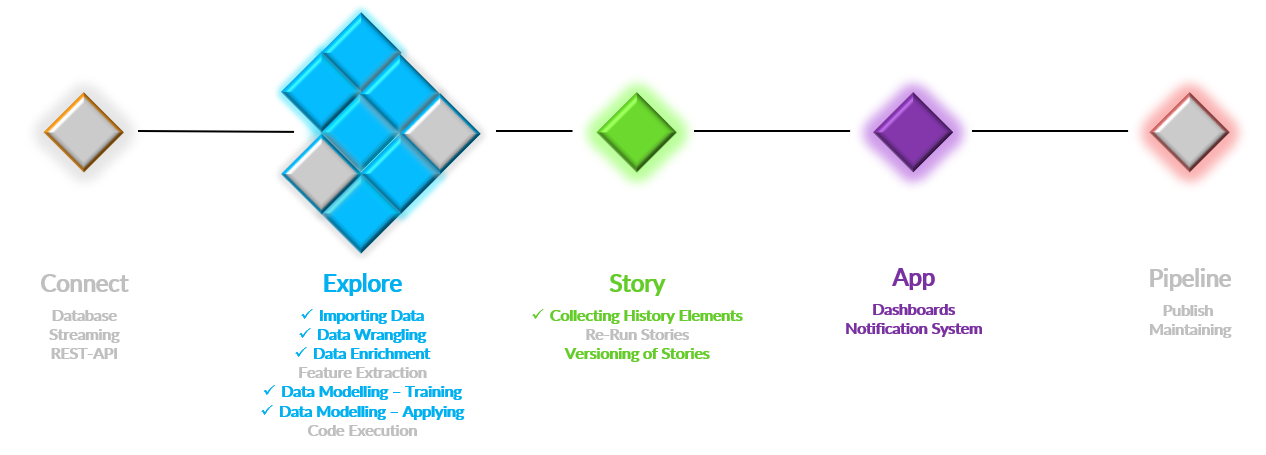
Figure: Project overview of Iris use-case
The colored tiles displayed in the above project overview figure are used in this Tutorial. The grey tiles Connect, some Explore (Feature Extraction, Code Execution), and Pipeline are not used.
If you want to check similar public use-cases, please take a look at these below links:
In the following sections, gradually I will
- Project creation and importing
- Exploratory data analysis
- Story creation and saving for future use
- Data pre-processing
- Train a model
- Generating test data and applying the ML-Models
- Discuss model performance
- Live App building
1. Project creation and importing
Let us create a project first and import the data. A public use case will be created in this case, and I will fulfill all the roles. A public project will be accessible in read-only mode for all users at that instance. All users who have a corresponding role within this project can also modify things. For more details of projects and roles, see here. An animation to create this project and import the data is given below:
Above, I have imported the file at the Data Navigation with default configurations. Look at the Import Data description to learn what configurations can be made while importing the data.
2. Exploratory data analysis
Before I start modifying the data or training the models, we will do some visualization to understand the data in this section. You can skip this section if you already know the insight of the dataset.
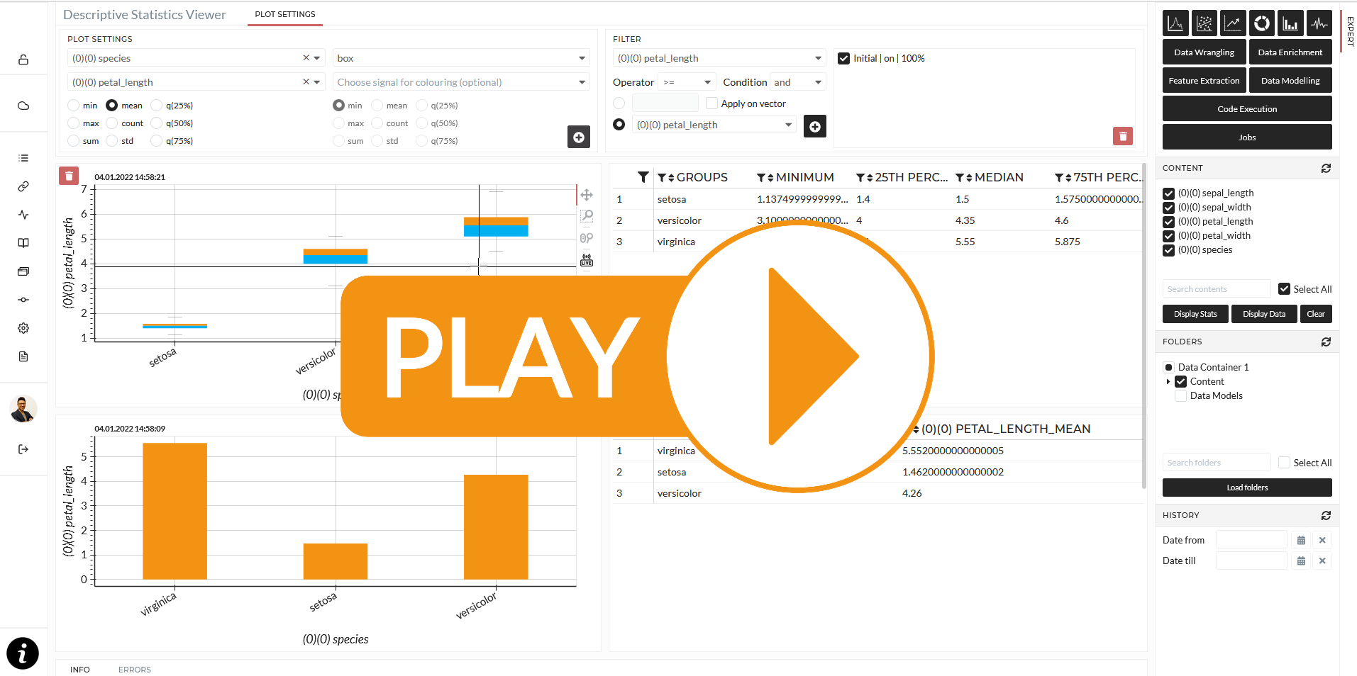
2.1. Descriptive viewer
I will start with some descriptive plots at the Descriptive Viewer. The following animation shows how I started to visualize some bar and box diagrams to see how the sepal length and width measurements and the petal length and width are between the different species of iris flowers. The lengths and widths measurements are generally called features. In the data science domain, you usually try to find or derive some meaningful and descriptive features and use them for training a model for the target, which is – in this case - the iris flower species. Let us look at the animation and then proceed with some discussions on several individual pictures.
The result is always displayed as a plot and multiple tables in the descriptive viewer. So for the second picture in the animation, I choose species in the first dropdown (Group by...), the petal_length in the dropdown (Choose signal for calculation) below, and mean as the calculated statistic. I also specified the bar chart. Let us have a look at the following image:
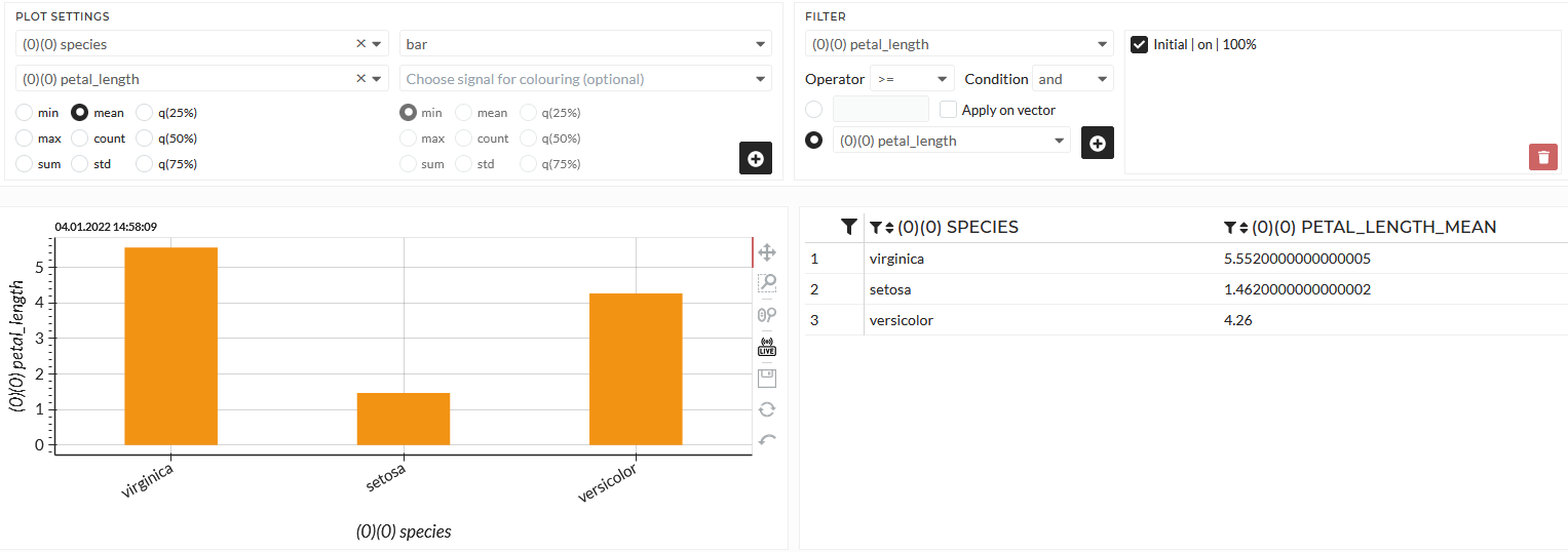
Figure: Average petal length over the iris flower types
You can see that the average petal length is very different between the iris flower species. Especially Setosa seems to be much shorter than the other two. The precise values are given in the table.
It becomes even more evident in a box chart. In a box chart, several statistics will be displayed simultaneously.
- median - the boundary between the blue and the orange box
- quantile 25 - the lower boundary of the blue box
- quantile 75 - upper boundary of the orange box
- Lower and upper boundaries of the whiskers - lower and upper black, a thin line around the box
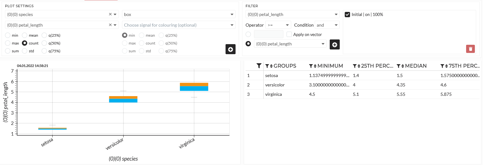
Figure: Box chart of petal length over the iris flower species
The table of a box chart has more statistics for the several groups than other plot types. See here to learn more about a box chart.
2.2. Correlation viewer
In Correlation Viewer, you can simultaneously visualize up to 5 variables in a scatter plot in the correlation viewer. By default, Histograms will be made for the x- and y-axis.
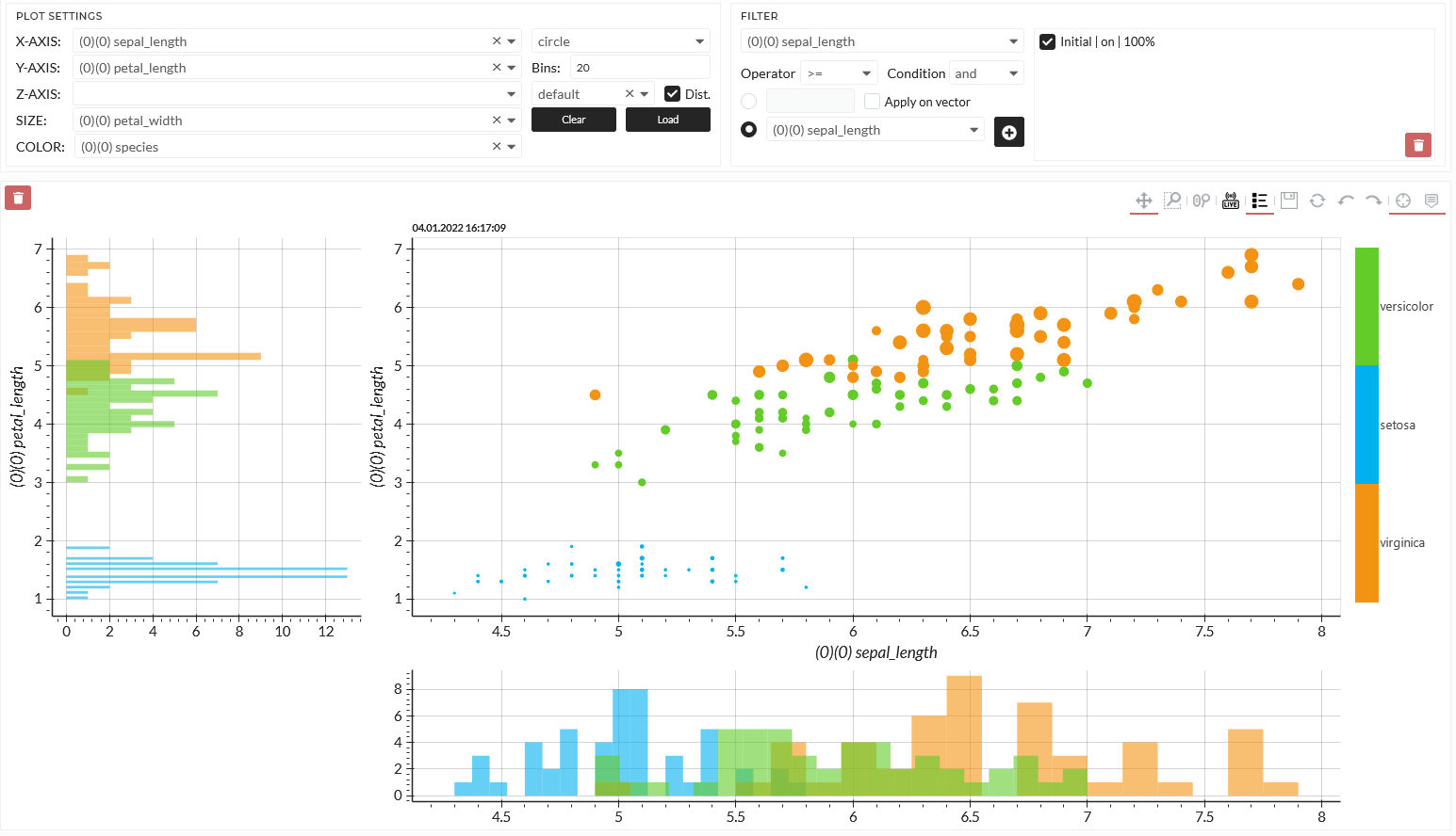
Figure: Correlation of different iris flower features and target
With that specification, I can easily distinguish by color the different flower species in the plot, and I can see the feature sepal and petal length directly in the x- and y-axis. The dot sizes indicate the petal width. It seems possible to locate the flower species accordingly on this map. Especially the Setosa seems to be easily distinguishable, whereas Versicolor and Virginia overlap.
3. Story creation and saving for future use
Before I want to start modifying the data and training the models, I want to save these findings as a Story to use in the future. The Story module serves a lot of valuable things. However, if you want to understand more about it, please look at the Story section. Let us collect some steps in a Story.
In our Story, so far, we have added two visualizations:
- Descriptive viewer visualization (history Element 1)
- Correlation viewer visualization (history Element 2)
Now let us start crunching the data and training our models.
4. Data Preprocessing
Data processing is significant before training a prediction model. In real-life projects, there is rare data that does not need pre-processing. The data may contain some missing values. You may want to delete these rows of missing values or replace them using suitable assumptions using Replace and Remove Tab. Also, data may contain unexpected data types like strings, where it is numerically expected. Many models do not support string data. So in those cases, you have to convert these strings into numbers using Label encode from Transform Tab. Sometimes data are not normally distributed, in that case, normalization or standardization is necessary using Normalize or Standardize from Transform Tab. Because some of the algorithms expect the data to be normally distributed to provide the best result.
I might need to prepare the data before building the model in this example. So let us have a look at the data. I can use the Display Stats button on the right sidebar for a quick overview.
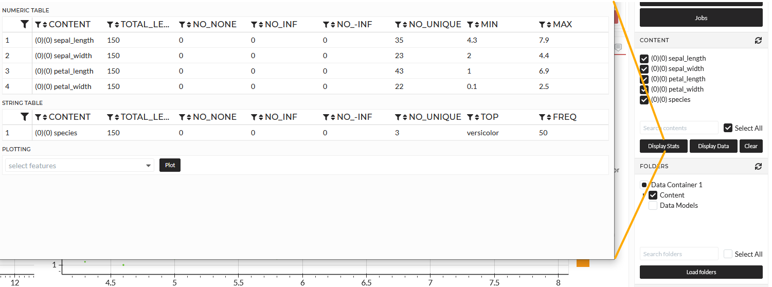
I can instantly see that my features are numeric, and my target is string type. I can also see that the data is very clean. It has 150 observations and no missing or infinity values. In this case, I may change the target Species to a numeric column because some models can not handle strings. Within this Tutorial, I will keep the target as it is, and it will remain as a type string. In this case, I only use models which can handle strings, and the prediction will also be of type string. So, we do not need any data pre-processing in this use case.
That is very good. However, as mentioned before, this is rarely the case in real-world problems.
5. Data modeling
I can start training the models now that the data is ready. In that case, I switch to the Train Model Tab in the Data Modeling Section.
Again, this use case aims to train models that only know about the features sepal length/width and petal length/width and can predict the correct species Setosa, Versicolor, or Virginica. Therefore, we need to set up precisely the features and the target for this training session.
I select all features in the features dropdown.
- sepal length
- sepal width
- petal length
- petal width
Then I select the (1)(0)species as a target.
Both dropdowns have a multi-select option so that you can train multiple targets simultaneously. Since the dataset is small, I select All Samples. I select the following models with different mechanisms to demonstrate the behavior later.
- Decision Tree Classifier
- KNeighbors Classifier
- Nearest Centroid Classifier
- SVC (Support Vector Classifier)
I choose the validation method - cross-fold validation is the most sophisticated and secure against overfitting. I choose a medium intensity. I leave the optional settings by default. That means no, ensemble methods and a Train-Test-Validation split of 70-15-15, and no Novelty Set**. To learn more about these settings and the models, please see Train Model.
Before starting the operation, I have to confirm the automatic assumption of the program - Classification or Regression and the metric I want to use.
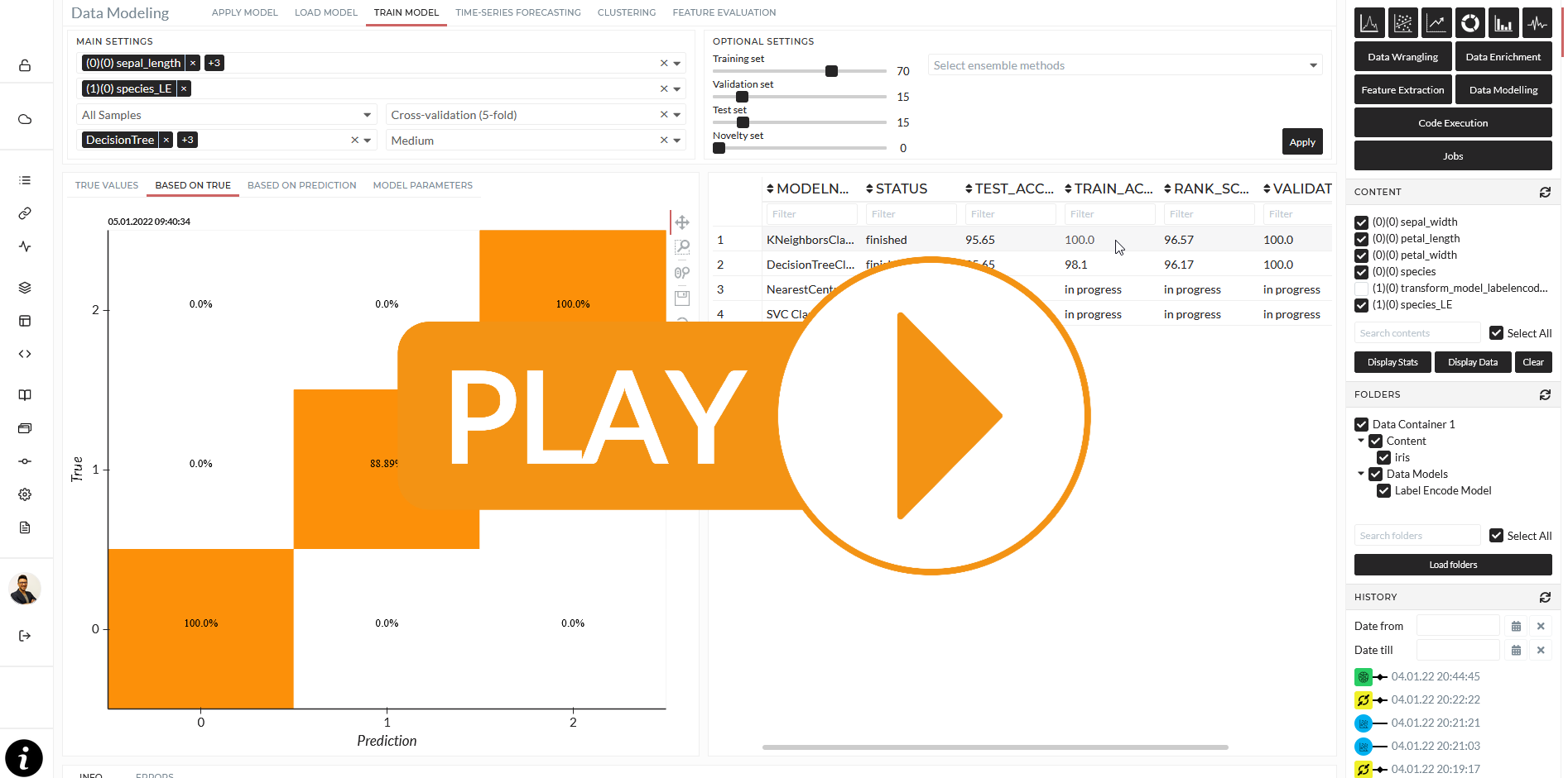
The result will be displayed in a table when the model's results are done. Whenever I click on a finished entry in the table, the results will be displayed as plots and a specific table for the model parameters.
The confusion matrix will visualize the model performance for classification tasks like this. Most models can predict class Virginica, and Setosa 100% but have a slide inaccuracy of class Versicolor. I can choose my best model based on the model statistics and proceed. Again I put the last operations into my Story. Up to that point, my Story looks like this:
I want to apply the model to new data and compare how each model will react. Let us have a look in the next section.
6. Generating test data and applying the ML-Models
I want to apply the model to new data and compare how each model will react. Let us have a look in the next section. Typically most of the publicly available datasets already have separate test data. However, we do not have any other data in this use case. I will proceed with this section to generate new data by myself for both:
- Demonstrate how to apply ML-trained models.
- Discuss how the different models make their assumptions.
6.1 Test data generation
I will generate data in the Data Generation Tab in the Data Enrichment Section. See the following picture:
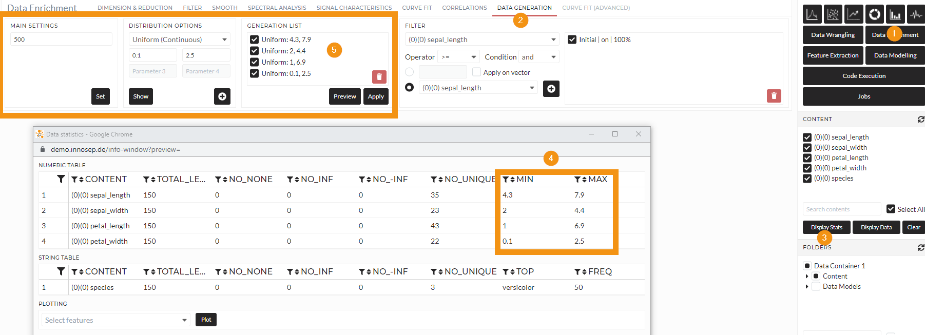
Figure: Generate 500 new data points within the boundaries of the features
I can discover the boundaries of the features while clicking Display Stats as before from the original train dataset and adjust my data generation accordingly. I used Uniform (Continuous) to generate a random grid and save it in the Folder iris_generic_generated.
6.2 Apply trained models
Now I can apply my previously trained models to the newly generated test dataset. I switch to the Apply Model Tab in the Data Modeling section and apply every four models to the newly generated dataset. Each model gives back a prediction as to the same number of data points of the generated test data.
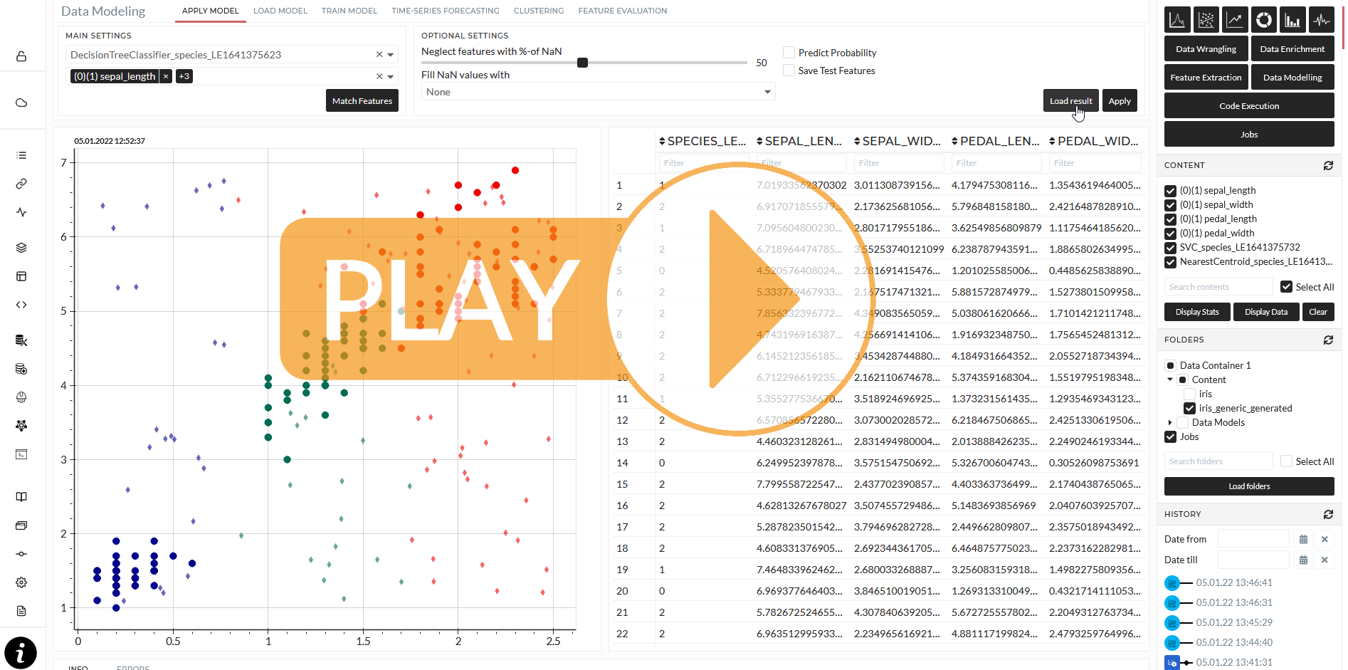
7. Discuss model performance
We now created a prediction for those newly generated data with four different models. I want to compare the results from Decision Tree and SVC with each other in the following scatter plots:
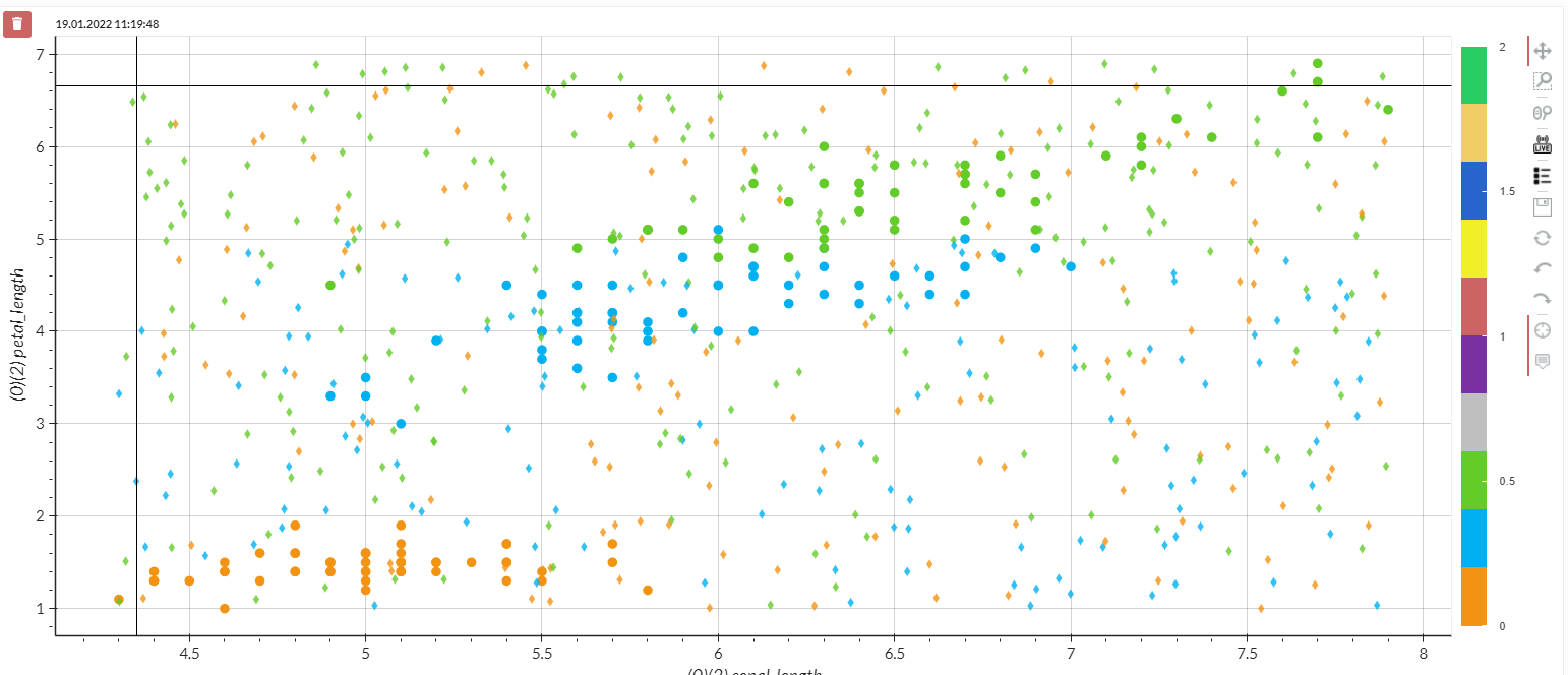
Figure: Iris species over sepal and petal length - circle dots are original observations, diamonds are predicitons from the Desicion Tree model
Looking at this figure, the predictions in the given clusters look okay but not good. Even within a clear green cluster, the prediction is off with orange points and vice versa. It becomes even worse outside of the given clusters.
Now let us take a look at the SVC performance.
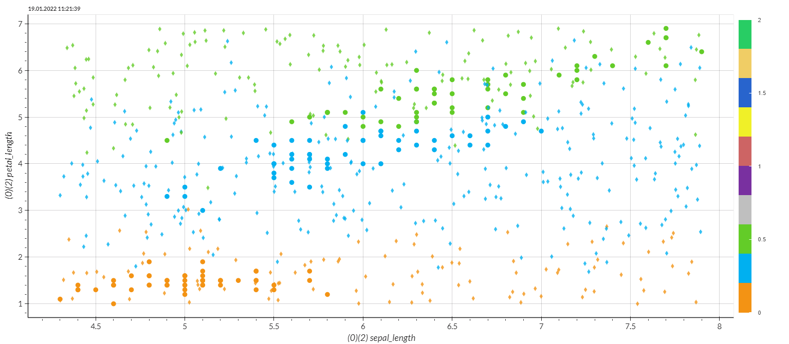
Figure: Iris species over sepal and petal length - circle dots are original observations, diamonds are predicitons from the SVC model
The overall performance looks much better. It seems like this model was able to learn the pattern better. Even though the training results of both models are the same, see:
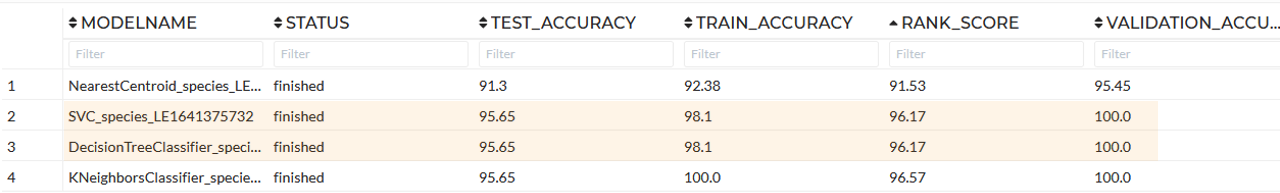
Trainig results of all models
However, why is that? Well, this is a crucial part of validating a model. Generally spoken, it is beneficial to keep in mind before starting modeling to get a dataset:
- as large as possible
- as clean as possible
- The number of features is much less than the number of samples/observations
Although tree-based models are usually less performant in real-world predictions than other techniques, especially older ones like Decision Tree, the XGB would perform more robust if the dataset is large enough (typically 10k-100k rows). The reason can be found in the way these models learn. Tree-based models try to segment the whole group repeatedly using thresholds in the features to correctly discriminate the targeted groups from each other. That is also why these models react so badly to data drift, extrapolated range, or new combinations, so-called novelties. Which - by the way - may occur in real-world problems. We have intentionally included a separate novelty set test within the Train Model Tab to handle this kind of challenge.
Other classical machine learning models like SVM (SVC for classification) or Logistic Regression have a more sophisticated learning mechanism. They work better in real-world cases because the range can go out of the known-trained data range. However, these models also have the disadvantages like the need for high computing power (because of poor choice of kernel or parameters), incapability of categorical feature handling, a limited number of features handling power, and transparency of learning. You can read more about this phenomenon, here, here and here.
8. Automatization and Live App building
My goal in this section is to demonstrate building an App with Apply model Story, including the steps:
- Notification System
- Dashboard
Earlier, we created a story and added all the Story operations. Now I will duplicate that Story and edit the duplicate one. The only necessary operation to go live in the duplicated Story is kept. I do not include the discovery and training part. I also include visualizations for my Dashboard later on.
Now I start building the App. First, I switched to the App module and created an App called Iris App.
I set up the title, picture, description, and user management as usual on the first page. I can define which Story will be used for the underlying analytics workflow on the second page. I can also see here each data and modification in every step. Finally, I can set up my notification system here. For example, receive an email whenever the species Versicolor is reported. On the third page, I can build my Dashboard. I can use any plot elements from the Story and add standard KPI and Gauge elements. The preview section is to modify my Dashboard as I wish with a double click on the borders and Shift+Q key on the keyboard. See here for more details about the App, Dashboard, and notification system.
9. Pipeline & Publication
Before publishing the app, let's discuss first the purpose of publishing the Live App and what needs to be considered before publishing it.
In this section, we will finally publish and automatize our application. That means the application runs independently from the platform as a microservice and can be deployed on any cloud, computer, or IPC included in the Kubernetes cluster. Therefore, it is wise to notice here that we do not want any training data to appear on the app meaning that we would rather need to create the story containing only test data including meaningful figures( plots, correlation viewers, descriptive analysis, etc.), and the trained model that applied on the test data.
By saying that, It is worthwhile to check before publishing the app if the story being created contains the right information that is needed. As you have already seen earlier, I created the story along the way while performing the Exploratory Data Analysis(EDA) to save some of the meaningful findings. Those figures are useful for our data analysis. However, to publish the Live App, I would need to recreate the story of the operations performed only with the test data so that my deployed app can handle the automated flow of the information from one point to the end along the pipeline that I am about to create in the next section.
As a result, to prepare the story and app for deployment, I recreate a new story with the insightful figures and the final model that has been performed with test data again in this tutorial. Following the same steps demonstrated under these following sections.
Once I have finished recreating my story and building the Live App. I am now ready to show you how to publish and use the Live App!
10. Publishing the Live App and using it!
I switch to pipeline, the last module of the platform. I select the Go-Live app and click on publish appeared on the right when placing the cursor on the app. I can see the list of applications that can be published in a table.
Here we can see the inputs of the data on the left top and the generated outputs from the application on the top right. The figure below shows the data input from the same folders and the output from this dataset. This is where you can check if your pipeline has any duplicated input data (a mixture of training and testing data). In that case, you need to reconsider creating another story for this Live App as mentioned in the previous section.
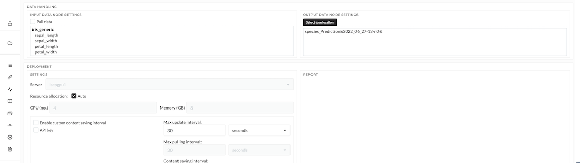
Figure: Input data for Live-App deployment
If I have external databases or resources, this is where to select the connections (connections to those must be prepared early by the connect module). This is not the case for this tutorial. Therefore, I keep everything as it is now. At the Server dropdown, I select the server to which I want to publish the application. I can check the resources of the instance and reallocate it if needed. In my case, I only set 4 cores, 5 GB of RAM, and 1 GB of Disk space for this application. If the server is a cloud resource, I need to activate the "Use Cloud Load Balancer" checkbox. Finally, I set up the maximum interval and maximum pulling interval - those configurations are needed to avoid a server overflow by too many requests at the same time.
By clicking on the report, I set everything up and see the URL to access the application and many other things. Finally, I click on "publish" to deploy the application.
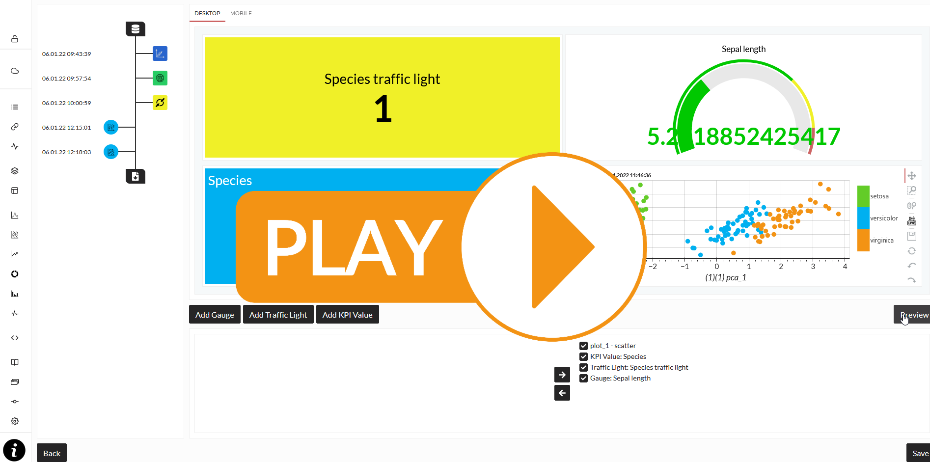
We can now open the deployed application. The application can be opened from the job scheduler. Once the status of the job changes to running, I can open the job to enter the application. I can now log in to the published app with my log-in data.
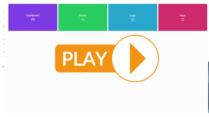
Inside the app, there are four sections here including the dashboard, status, logs, and keys. We will focus on the dashboard section in this tutorial. The dashboard will only function once it receives the data. Here, I will show how to feed the data to the application. Although the detail of how to publish the app can be found in the pipeline module, I would like to emphasize the two options that can be used to send data to and get a response from the app. (NOTE: To get the app to function properly, the data is needed to be sent to the app.)
-
Excel File - In this tutorial, I use the ready-made excel file in which I can simply adjust the information such as data, stream key, and the URL to interact with the app. (NOTE: This excel is compatible for Microsoft users, it may need to be adjusted for other users or you can use the second option). Click to Download
-
Script - Another option is to use the script to perform this step. The examples of both scripts can also be found in the Pipeline section.
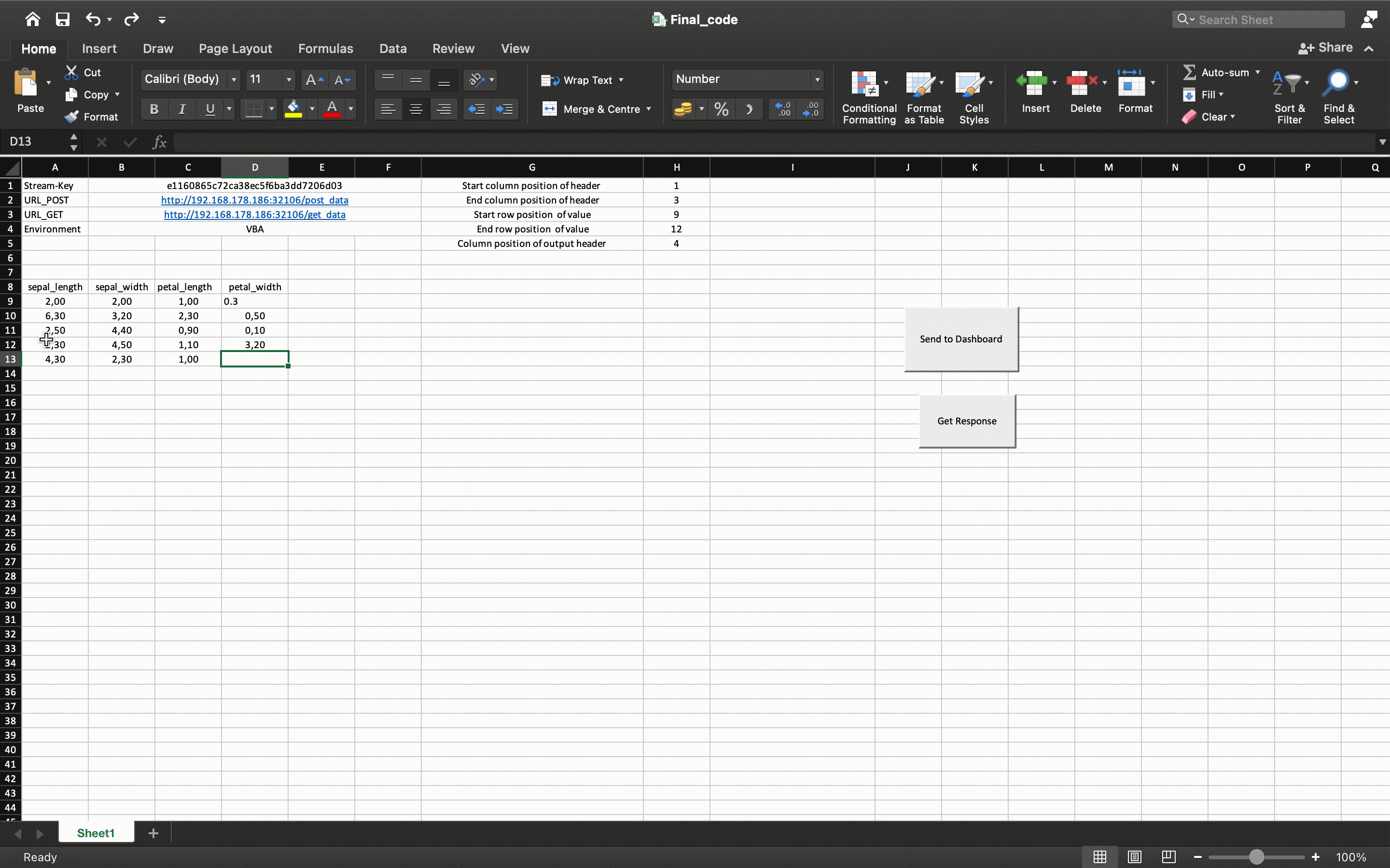
Figure: Example of an excel file for sending data to the deployed app
In this tutorial, I use the ready-made excel file mentioned earlier which can be adjusted simply. To send the data to the app, I will need to collect the required information which is the stream key and the dashboard address. This information already appeared when we click the report button while publishing the app. However, it can also be found in the info section of the job scheduler where we open the deployed application also. I gave all the inputs to the app including the stream keys and the addresses of my application. Do not forget to adjust the row and column position numbers in the excel file to avoid any errors as shown in the figure above!
Once I send the data, the app will start running, the interface will change in response to the data sent and the application we have set while building the app. To predict the new data, I can just press the "Get Response" button in the excel file. The prediction will show on the right column next to the data area.
Additionally, the interface of the app can be adjusted freely by pressing Shift+Q key as we have done in the app-building section. The figure's setting can also be changed. I can right-click on those figures and change the setting of the graph and plots such as labels on the x and y axes. It is important to note that the setting of these figures will only change temporarily. If we re-open the app again, the setting will go back to the default version.
10.1. Publishing the Live App and using it (extension)
In this section, we will finally publish and automatize our application. That means the application runs independently from the platform as a microservice and can be deployed on any cloud, computer, or IPC included in the Kubernetes cluster.
I switch to pipeline, the last module of the platform. I select the XY app and click on publish. I can see the list of applications which can be published in a table.
Here we can see the Inputs of the data on the left top and the generated outputs from the application on the top right. If I have external databases or resources, this is where to select the connections (connections to those must be prepared early by the connect module). This is not the case for this example. Therefore, I keep everything as it is now. At the Server dropdown, I select the server to which I want to publish the application. I can check the resources of the instance and reallocate it if needed. In my case, I only set one core, 2 GB of RAM, and 2 GB of Disk space for this application. If the server is a cloud resource, I need to activate the "Use Cloud Load Balancer" checkbox. Finally, I set up the maximum interval and maximum pulling interval - those configurations are needed to avoid a server overflow by too many requests at the same time.
By clicking on the report, I set everything up and see the URL to access the application and many other things. Finally, I click on "publish" to deploy the application.
- Here we need then to describe how they open the deployed application
- How they can use it now - excel-sheet should be provided as download. to feed data.
- I have a little troubles with following: a) re-run story and explanation why? b) the dashboard i have build in the first place seams not to be possible because traindataset is needed and streamed data is needed.